Showing posts with label Project. Show all posts

Saturday, April 3, 2010

How to go from sketch to finished painting – Part 6 – chess board pattern

What is it about working in a church that makes me want to sing entirely inappropriate songs?

Like Tom Lehrer, Little shop of Horrors

and, of course, Rocky Horror

What can I say, I’m a bad girl! It’s like telling someone not to think of elephants!

I’ll just wait while you try not to think of elephants…

(nonchalant whistling)

Good! You sorted then? OK, I’ll continue

The painting continues with an area bottom left that now has a chess board like pattern. These are the photos of the masking out and painted board.

 Masking squares Painted squares detail Painted squares

I started sketching in the figure again but it wasn’t working well so I’m going to tackle it on paper, actual size, and then draw around it.

I’ve just the figure to do now, some twiddling and some splattering.

(So looking forward to the splattering.)

I’ve been seriously frustrated at the time it’s taking to complete. But I think I can see the wood for the trees, finally! Wayhay!

Part 1

Part 2

Part 3

Part 4

Part 5

Wednesday, March 31, 2010

How to go from sketch to finished painting?–part 4 –Lessons in masking - lettering in artwork

Stage 7

To be honest, I hate lettering!

Well, applying lettering in artwork that is. My style is more organic and flowing. I like movement and asymmetry. Letters require a degree of precision and a methodical approach!

Now, I ask you, does that sound even vaguely like me?

Precisely my point!

But, do you think I would change an idea which was essential to my art? Well, do you?

Absolutely, positively no! Which means I’ve got to face my demons and draw those fonts. Groan!

Which is why I spent most of today up to my eyeballs in frisket film! Drawing and redrawing lettering. Then the cutting out! So much cutting that I’ve no feeling in the tip of my right index finger. Try using a touchpad with a numb finger, weird. 

Anyway, I digress, the inspiration font is a complex design so I’m not quite ready to apply the black paint! Nearly but not quite. MaƱana!

Masking is always a slow job. It needs to be done precisely. But the painting should be done in a flash. So, without further ado,and realising that there’s a lot left to mask… and, of course, I haven’t painted it yet!

Here’s the panel!

CIMG4650

I just think it’s a shame I can’t leave the frisket film in place, I love the effect!

Next step, painting!

Part 1, Part 2 and Part 3.

Monday, March 29, 2010

How to go from sketch to finished painting?–part 3 –Hand painting circles, the hard way.

Stage 6

The project continues from here and here

There must be easier ways of painting circles! I’m sure! But I’m not using them because…?

Well I’m not sure of that either!

Probably because I don’t have a computer controlled cutter that works. (I have an old one but no software compatible with Windows 7). I need to touch up the circles but there’s progress. Is it me, or does it look like an eye test? You know the which is clearer the red background or the green section! And the white shape reminds me of one of the six badges on brownie uniforms from the 70’s. I was a “Kelpie” – see image below right (Courtesy of ebay sales pages). There was a white one, but I can’t remember the name to search for the image.

Circles painted


I now need to cut masks for the letters. After mulling over the design some more, I’ve decided to work the letters in a trashco font style. Not exactly the same but close enough to get a similar effect. As access tomorrow is and issue, I’ll be working from home. I’ve measured the space and I’ll draw the letters and cut them out using frisket film.

Time to get my hammer and hole punches out. I’ve a feeling tomorrow will be very noisy!

Saturday, March 27, 2010

How to go from sketch to finished painting?–part 2 –Transferring the Thumbnail to the board.

Can watching paint dry ever be exciting? Continuing from yesterday’s thrilling post. Ok so thrilling might be pushing it a bit, hey, a girl can try can’t she?

In any big project like this is there will always be some lengthy repetitive stages- i.e. the boring bits. Like painting a huge board all one colour and waiting for it to dry. It’s literally as exciting as watching paint dry! Early afternoon I painted a second blue coat to achieve a solid block of colour.

2nd coat

The plan was to return later and start the interesting stuff. Domestic chores nearly interfered with my return, but return I did.

Stage 4

Next, I marked out most of the main shapes. That was the plan before I ran out of masking tape – too late to buy anymore, curses! I continued with  pencil but the marks can’t be seen on the photograph here.

Masking out

Stage 5

I had enough time to apply some black paint, immediately removing the masking tape. It’s essential to remove the tape while the paint is still wet in order to get a clean paint edge. However fingers tend to end up very messy! I’m so glad acrylic paint is water based.

masking removed

The lines as they stand remind me of musical stave lines, I’m almost tempted to change my design to incorporate musical lines. I say almost, but I need to stick to my original idea.

Finally I tidied up so it’s all ready for the church service tomorrow.

I can’t get access tomorrow, so the next instalment will be on Monday. Then it’s  time to start playing with paint effects.

Friday, March 26, 2010

How to go from sketch to finished painting?–part 1 – Documenting a Church to Youth Centre Art project.

How do you change a church hall into a teen friendly social club? This how we’re doing it!

Our local Youth group needs help to counteract the look of churchy building where it’s moving to.  To help create a youth friendly feel, the working party have made 4 panels to cover the windows. I’ve been asked to decorate one as inspiration and the youth are going to be encouraged to decorate the rest. The panels are 6 feet high by 5 feet wide, a big project!

So, this is my “canvas”!

Undecorated board

Scary isn’t it!

Stage 1

Design!

The brief was for the design to appeal to young people i.e that it should be “Cool” sorry “kl”. It also needs to be accepted by the church.

OK, I need to find out:

1) What is the “in thing” with teenagers nowadays?

2) What would the church be willing to accept

In addition I need to consider

3)My budget is zero! So I’m relying mainly on freebies of household wall paint for the large areas and acrylics- Galleria system 3 – for the details. And anything I feel inclined to donate.

4)Where will it hang? In this case – quite high so needs to be visible from a distance.

So, back to first question- What is the average teenager interested in? TV programmes, computer games, Manga, Steam Punk or something else? I did some research into Manga and Steam Punk and decided they might be OK for a targeted group e.g. teenage boys who played lots of games. But it might not suit a generic youth group. The trouble is, it’s been a long, long, long time since I was a teenager!

Then my thoughts went to gaming consoles either the controllers or buttons. Would the buttons be better? As they weren’t going to be specific to one company – can’t be advertising, not in a church. (No, that wouldn’t do at all!)  I finally remembered the recent ipod adverts with figures dancing and that a silhouette would look quite effective from a distance. I’d also thought about urban text styles such as found here

Stage 2

After playing around with these themes and ideas for most of yesterday, I finally came up with the following thumbnail sketch. (Some of the detail has been lost in the photograph.)
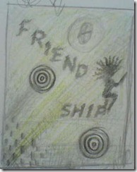
Thumbnail

My plan was to stick with a bright colour, green was my first choice, and paint the rest of the design in black keeping lots of visual pattern – a distressed look.

Stage 3

Next I roughly pencilled in the design and painted the background.

As with many projects subtle things change between the design and the execution. Well they do with me as I think of refinements with the design or sometimes just change my mind. Which is why I’ve now gone for blue as the background colour. Purely from the practical point of view – there wasn’t enough green but plenty of blue and red - I preferred the blue. So this is the work so far. I’m letting it dry tonight and will continue the project tomorrow!

Base coat Completed basecoat

As usual I’ve practically obliterated all the preliminary marks. It looks a bit like a snow spirit dancing against a frozen sky.

So, that’s my progress so far. Tune in tomorrow to see the next exciting instalment. It’ll be as exciting as watching paint dry!