Showing posts with label red. Show all posts

Thursday, October 21, 2010

Tuesday, September 14, 2010

Friday, June 11, 2010


http://www.endless.com/dp/B002T45FGO/ref=asc_df_B002T45FGO1137260?tag=endlesscj-20&creative=380333&linkCode=asn&creativeASIN=B002T45FGO

Wednesday, April 21, 2010

Beating artist’s block – 10 ideas I’ve found helpful

Don’t you just hate it when you don’t know what to paint or draw or create?

I found myself in that situation today and thought I’d remind myself what I could do to reinvigorate my creativity!

  1. I keep a sketchbook with me at all times. Jotting down the ideas as soon as they come. If I’m stuck what to do I have a look through it.
  2. Playing with different media – using the opportunity to try a new technique can really help spark an ideas.
  3. Going for a walk with a sketchbook take time to stop and sketch anything which catches you eye.
  4. Looking through books and magazines. I found a really good book on abstracts recently “Painting Abstracts” by Rolina van Vliet and there are loads of exercises to help inspire creativity.
  5. Visit a real Art Gallery – seeing another artist’s work can stimulate an idea.
  6. Visit art websites and galleries online. Lots of sites such as Painter-online and Empty Easel have online tutorials. You might not wish to reproduce the image they demonstrate but they are a good source of advice and can be inspiring. Even if it’s only I can do better than that! It can be fun to do a subversive version instead.
  7. Rip up a magazine or seven and make a collage. Be surreal or funny if you’d like. e.g. Kerry Katona’s head on K9’s body. Oooh I like that idea!
  8. Doodle! Make a mark on a large piece of paper and fiddle with it. It helps free up your mind and sometimes you get a great idea for a project.
  9. Go out and take photographs. Play with exposure, cropping. Go in close and personal. Focus on details. Look for different angles.
  10. I got stuck with artist’s block here!!!!!!!! Then I remembered. Hoik out an old sketchbooks, flick through and pick one page. Then look at it upside down, sideways or squinting. Sketch or trace some or part of an image. Use a limited colour palette and paint the new sketch

In all this, don’t worry about how it will turn out. Look on it as an exercise. Be patient, inspiration will come.

So, which option did I resort to?

4

and here it is.

Potential

I’ve called it “Potential” I love brickwork, I might have said so before! I was playing with ideas to create brickwork and this sort of evolved. The signature as the artwork.

Been looking at too much conceptual art methinks!

Tuesday, March 16, 2010

Sketches of Buckingham in the sun – suffering for art?

Sometimes I think I’m a bit “schizophrenic” when it comes to my artwork. (Although, to be precise, that should be a multiple personality disorder rather than schizophrenia – 3 years of Occupational therapy training wasn’t completely wasted! ) By which I mean I have warring urges relating to the type of artistic direction I wish to pursue. I started this blog to promote caricatures – lets call that “Style 1”. I always had the intention of portraiture alongside the caricatures, so we have “Style 2”. Then I started doing landscapes – “Style 3” and still life work “style 4”. Then, I discovered a style of abstract art that suited me, “Style 5” emerged! Finally I enrolled on a life drawing class which led to “Style 6”. Sometimes I desire to work in a realistic style, but it all seems to have been done before. I’m not an artist who enjoys reinventing the wheel! But then I think “I know I can do the realistic work, what’s wrong with that?”.
So it was, last night I was painting abstracts and this morning I found myself sitting under a leafless beech tree. ( I feel I ought to  stress that beech nutshells are NOT comfy to sit on.) My fingers turning a little blue with the cold (NB sunshine does not always equal warmth) sketching one of Buckingham’s historic buildings – I think it’s an old coaching house but I need to investigate further. My result is fine. Better than my shaky sketches of people on the train yesterday, which, in places, resembled seismic readings more than drawings. I now have a dilemma! Abstract or sketch, what is it to be?

A…

…n Abstract (sorry to any Lynn Truss fans out there, your inner pedant must be screaming!)
Point of view
I think I’m going to call this one “Points of View” I was thinking about perspective and constraints on growth as I was constructing this.

Tuesday, March 9, 2010

Pink meets purple – the battle of the circles.

After yesterday’s mega productiveness I’ve really struggled to do any art today. Partly due to getting to bed last night and being really tired but mostly due to allowing myself to be distracted by trivia…fatal! I managed a sketch while on my way back from town – only had a short time so it isn’t finished. Otherwise nothing.

I shall therefore upload this image which was finished yesterday. Still not title for yesterday’s but I might call this “Communication” and I haven’t re-photographed either of them yet, so blurriness prevails. Having said that this is better than yesterday’s.

CIMG4623

Monday, March 1, 2010

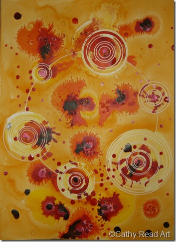
Core values – a circle based abstract in blue, red and silver

I’ve been nursing 3 sick children today, but still managed to do the odd sketchy thing and even play with the acrylics. I emphasise the play, it’s not a piece I think has any artistic merits.

So, in the time honoured Blue Peter tradition, “Here’s one I did earlier”

Core values

This one’s a bit metaphysical it’s called “Core values”. The circles are layers of our personality,  the spikes representing parts of our character which penetrate our very being, transcending the layers of daily routine behaviours and thoughts becoming more complex as we reach our ‘centre’. The blue and red colours reflecting competing desire of passion and calmness. I know, far too deep for a blog about cartooning. What can I say, I’m evolving?!?!?!??

I’m now going to ruin it all by saying I keep thinking of ice cream when I look at this! The red reminds me of raspberry ripple!
Wednesday, February 24, 2010

more thighs


London Fashion Week: Vivienne Westwood Red Label Fall 2010

Tuesday, January 19, 2010

Back to the beginning?

The commission is still haunting me, there are some issues with likeness. Just been sent a picture which, had I had it earlier, would have made the whole process so much easier. I’m trying to decide whether or not to tweak or start again! Part of me would really like to cut my losses and start again and the other thinks, Oooh no, not again! I think it’s going to be a start again as I firmly believe the client should be happy with the picture. That and tweaking always looks messy.
Having written the above this morning, I decided to start again. I’ve nearly finished pencilling in the picture. I’ve not had time to do anything else but I’m happier about the picture than I have been at any time previously.
So, I’ve decided to post one of my abstracts from yesterday. I used a slightly different technique on this one. I really like the way the colour have mixed. Not sure on a title yet - oh that sounds familiar! I quite like “Venus” or “Orbit” decisions, decisions…
CIMG4445

Monday, December 21, 2009

redddddddddddd

getting ready...


wished i could have worn all red for dec.
oh well.
yesterday i had it on and felt like my color intensity was offensive to me and others.

Tuesday, November 24, 2009

redgobblegobble


built by wendy